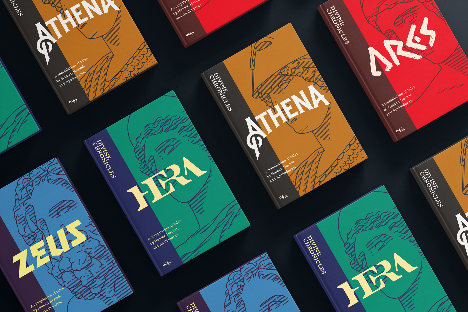
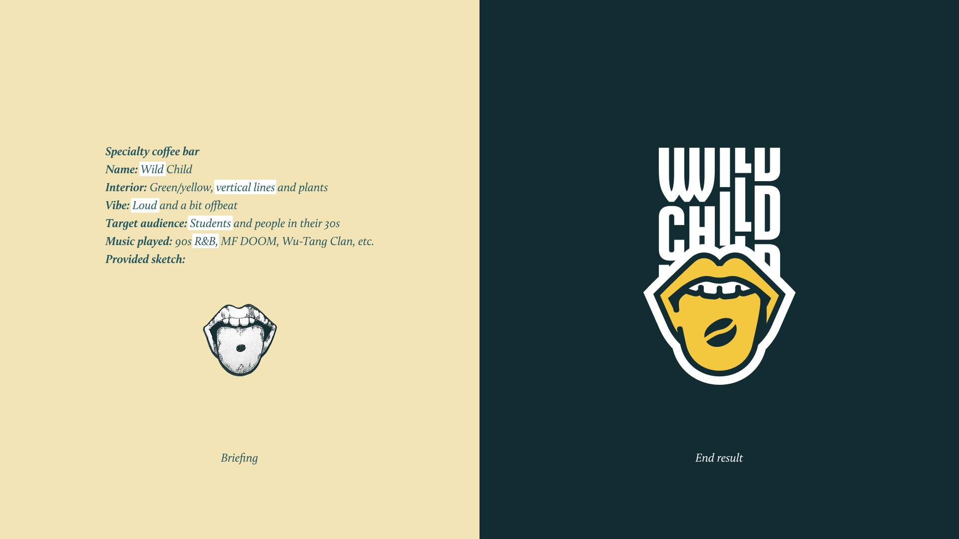
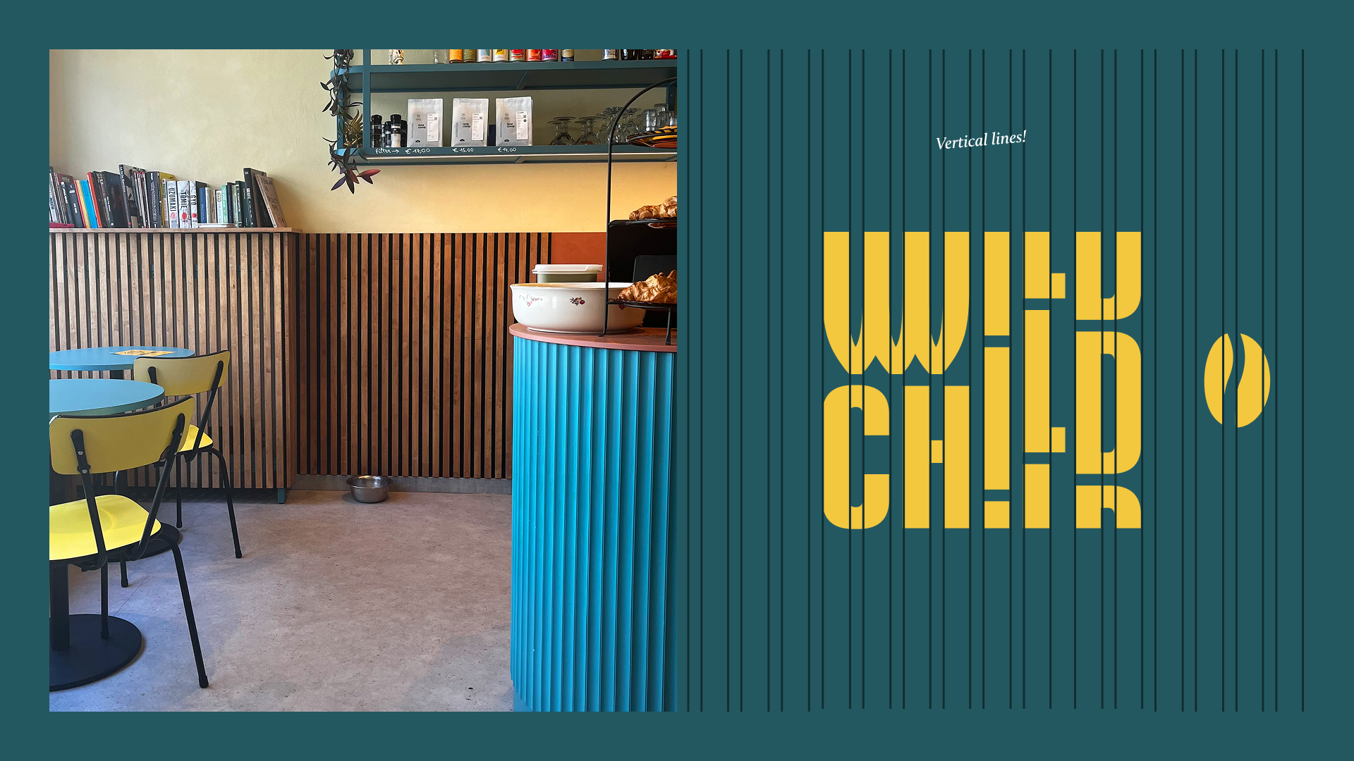
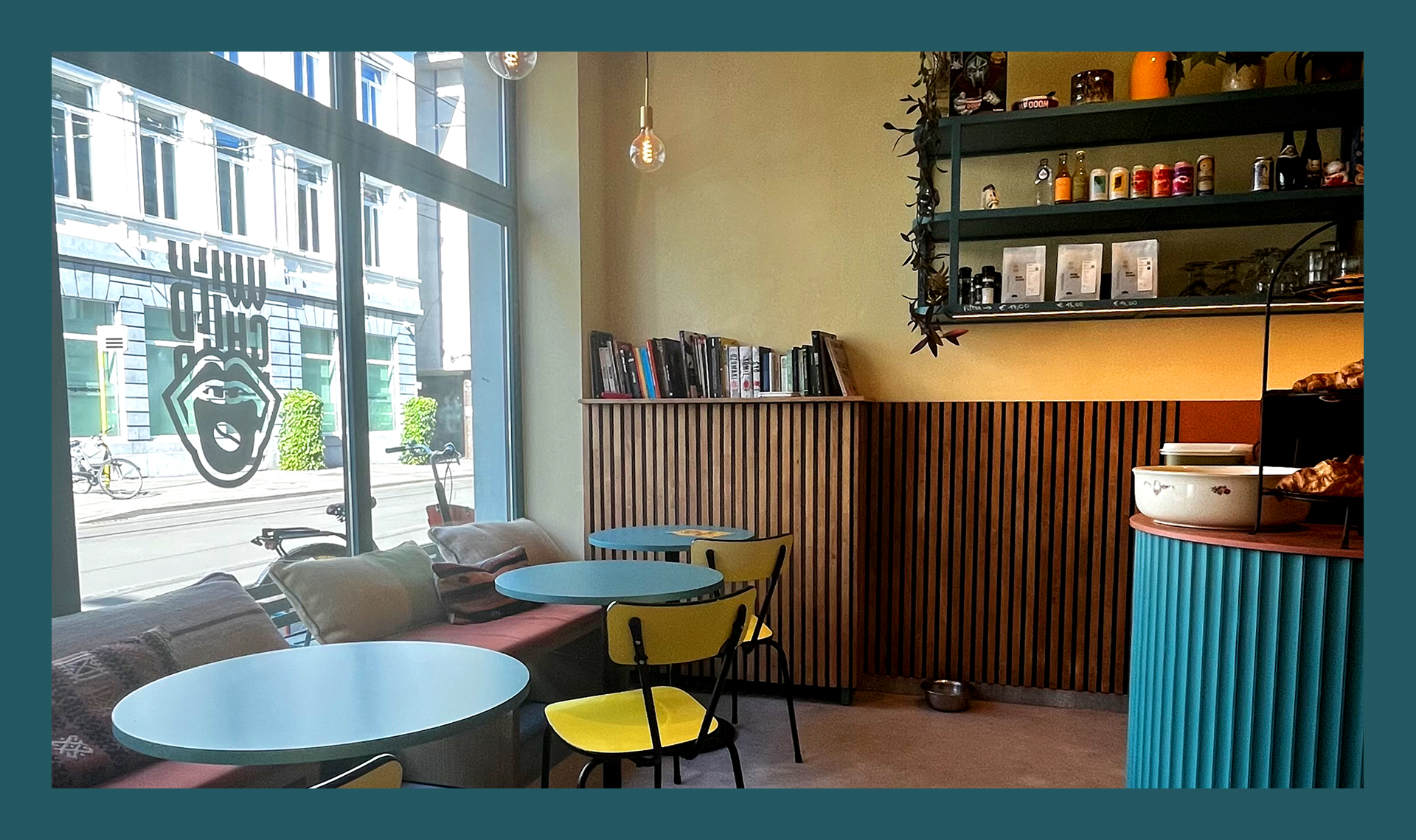
Wild Child is a trendy espresso bar in the heart of Gent that wanted a visual brand identity to reflect their rebellious spirit, love for 90s R&B, and lively atmosphere. The café serves as a welcoming space for Gent's diverse creative community. With students and the 30+ crowd as their target audience, they needed a logo that stood out in Gent's bustling coffee scene.
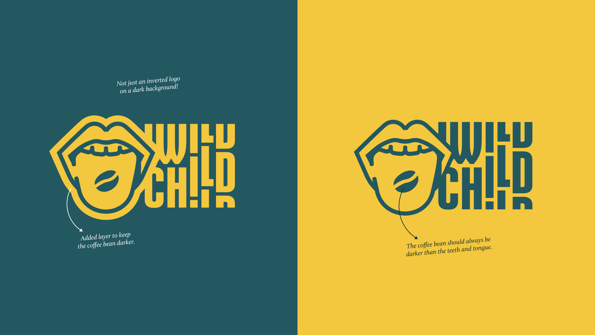
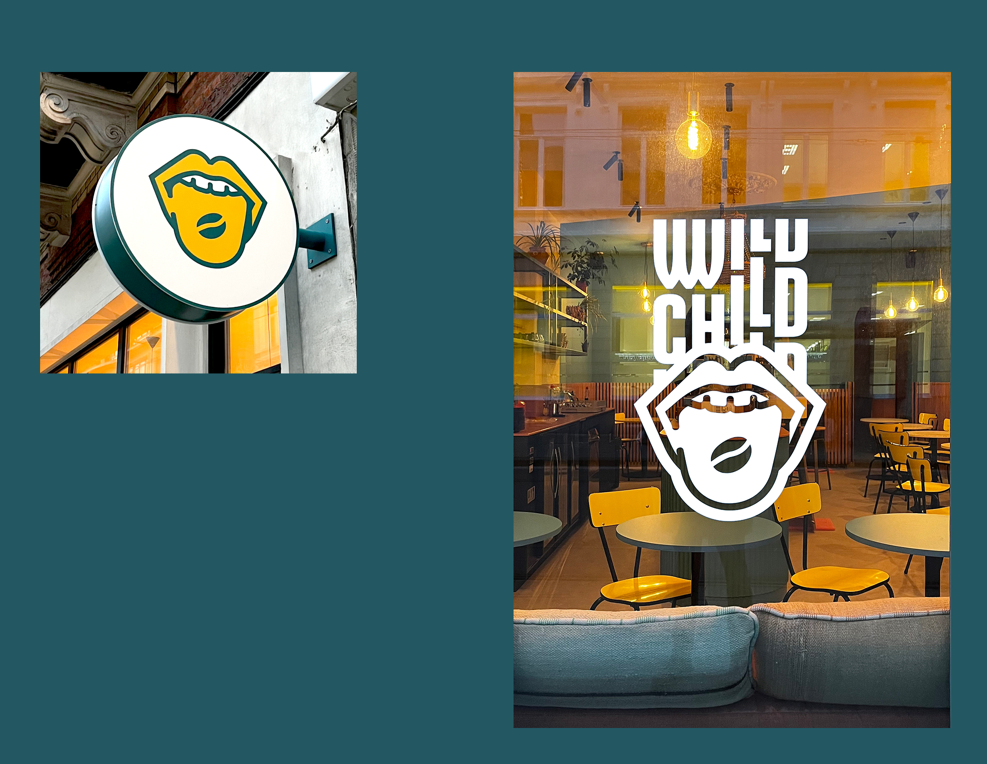
The client came with a logo idea in mind: a coffee bean resting on a tongue, playful and daring, but it resembled the famous Rolling Stones logo, which wasn’t ideal for their background music style or target audience. The café’s interior design was already in progress, and it was important to me that the logo aligned with their established color scheme and decor for the best visual brand impression.
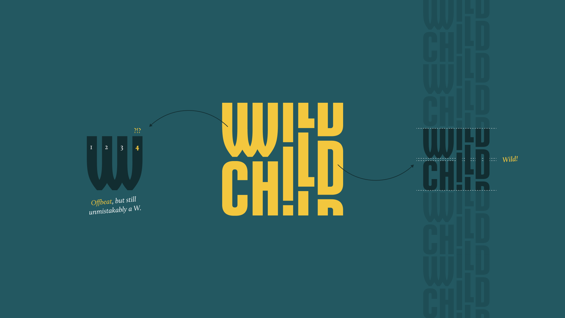
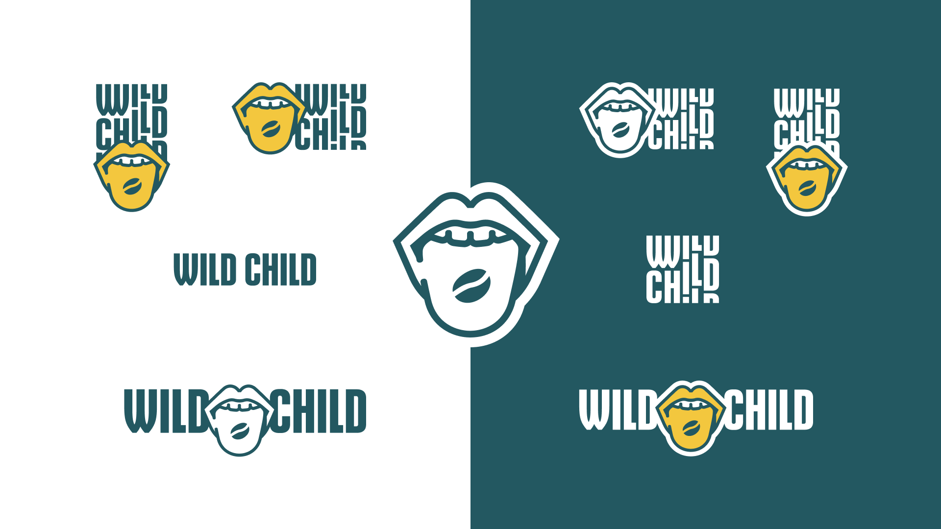
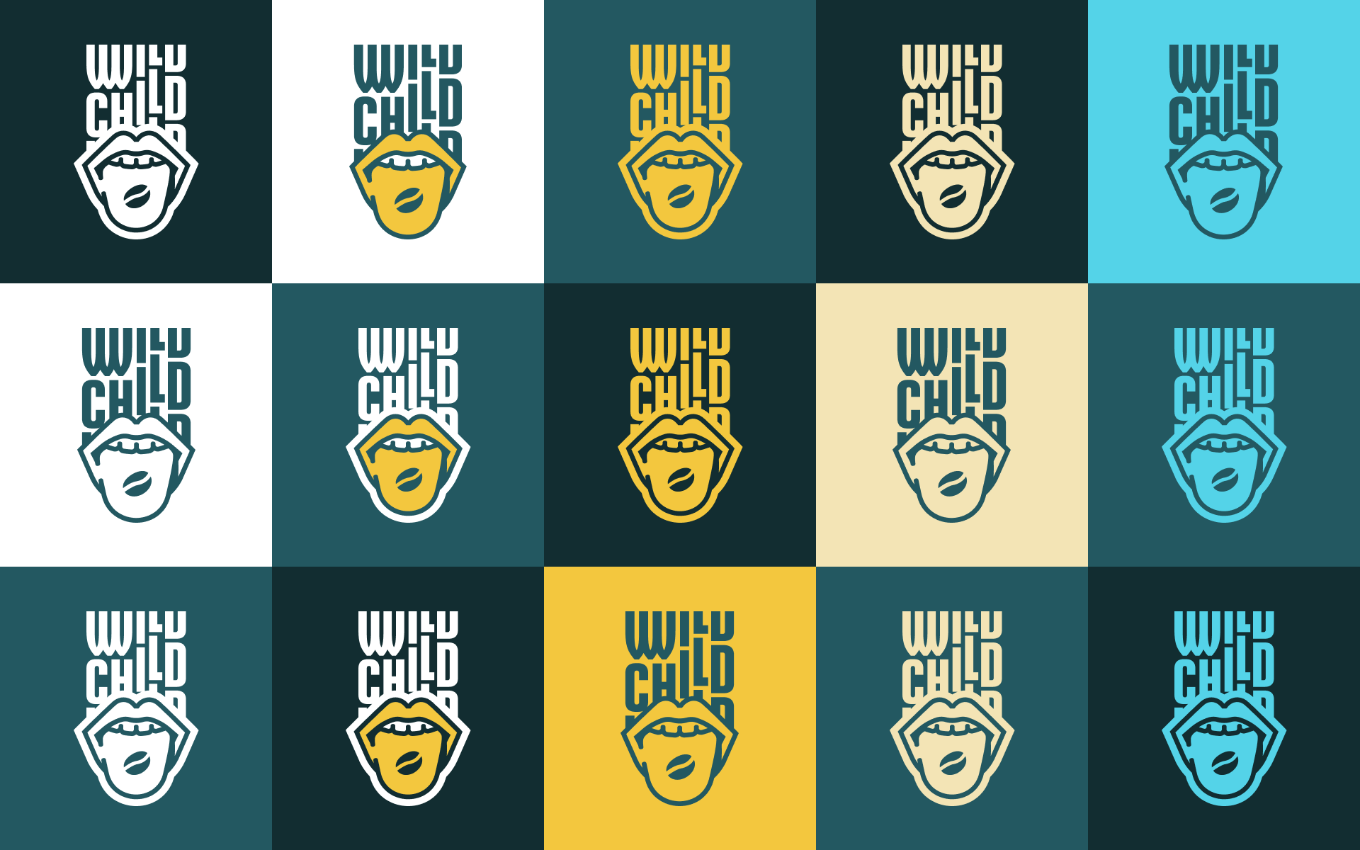
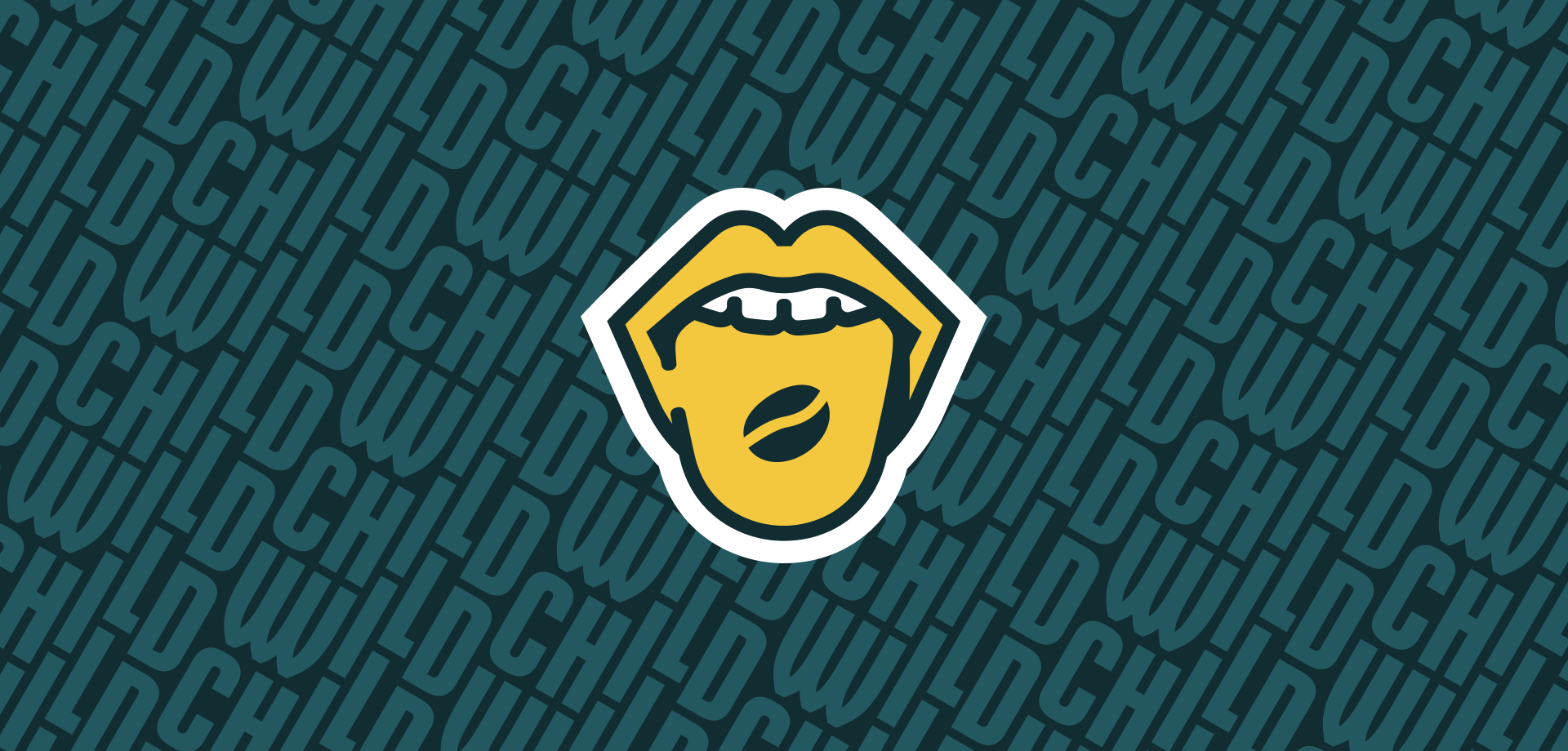
I redesigned the logo by keeping the playful, cheeky coffee bean-on-tongue idea but giving it a fresh spin. Drawing inspiration from vibrant 90s R&B aesthetics and the eclectic interior design, I created a modern logo with bold typography that mirrored the energy of the café. And just as importantly, this design avoided any comparison to the Rolling Stones logo in tests, while still maintaining a distinct, memorable look.
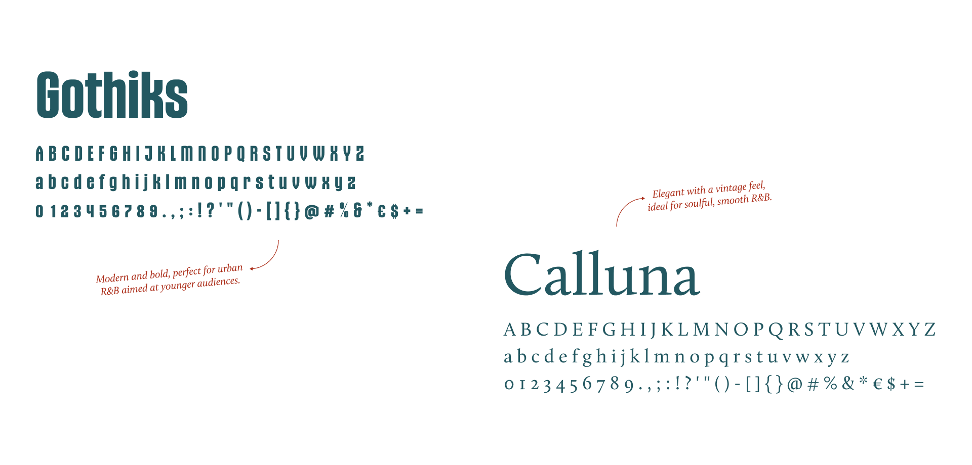
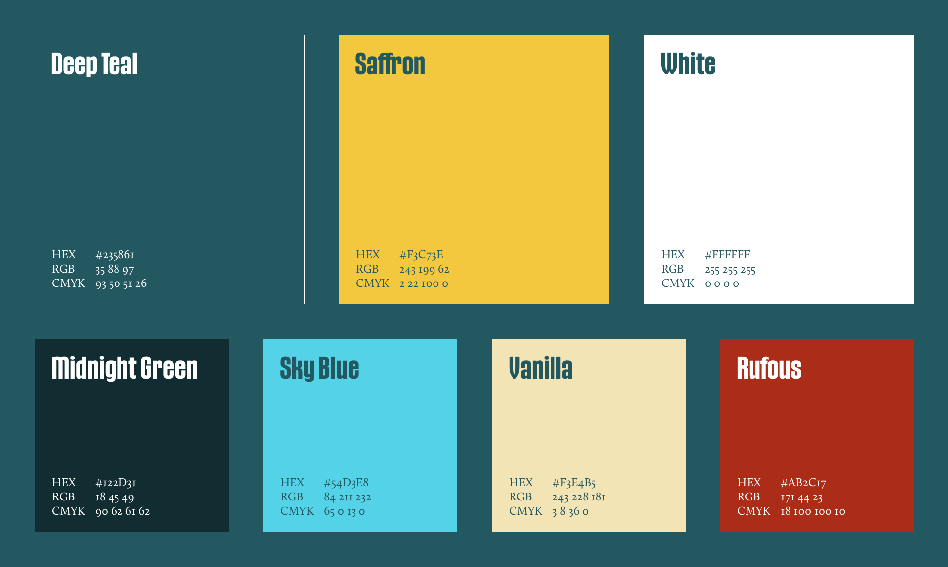
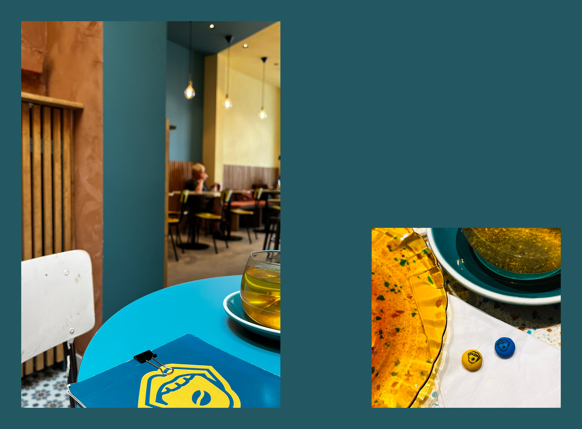
To complement the logo, I chose a narrow, sans-serif typeface that echoed the vertical lines in the café’s interior design. The color palette, featuring vivid contrasts, mirrored the café’s lively atmosphere and musical influences, ensuring the brand’s voice was loud and clear.
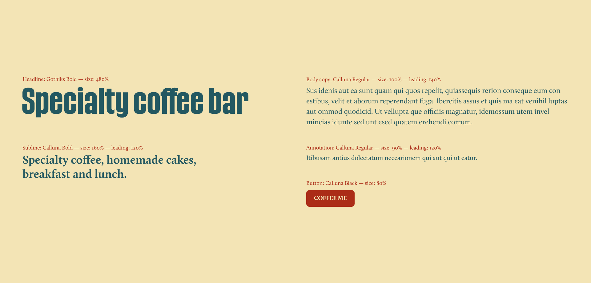
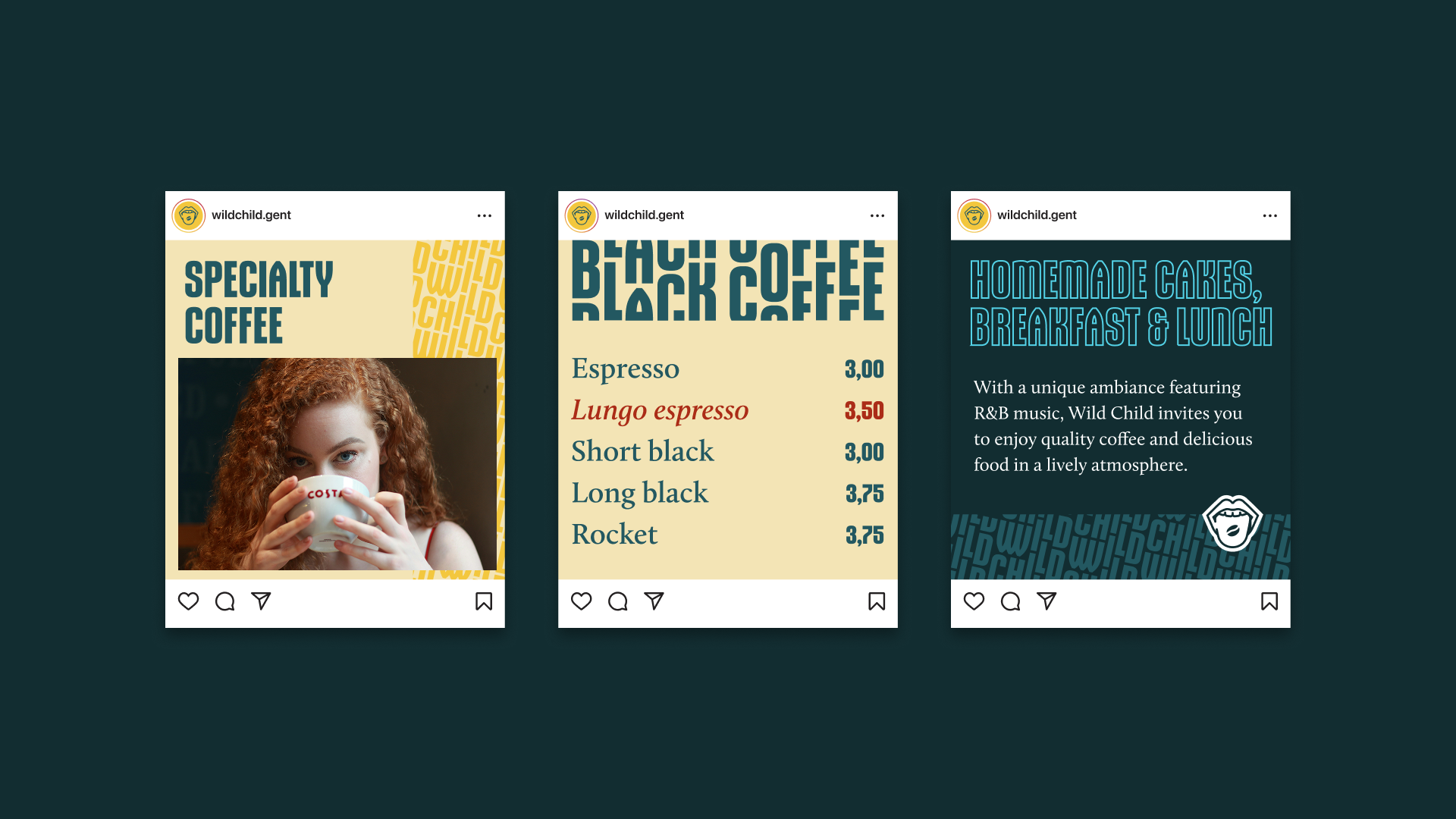
Visit Wild Child for specialty coffee, breakfast, lunch, or homemade sweets at Burgstraat 139 in Ghent, Belgium, and be sure to pass on my regards to Bram!